Using Color in Home Design Part 3: How to Create a Cohesive Home
Updated: Aug 31

This post may contain affiliate links. If you purchase through these links, I may earn a small commission at no additional cost to you. I only recommend what I truly use and love.
In Part 1 we built a color palette. In Part 2 we learned how to use the color wheel. Now it's time to put both to work.
This post shows you how to apply your color palette throughout your home so every room feels intentional, balanced, and connected.
I’ve also included the frequently asked questions I get about using color at home.
Start with the 60-30-10 Rule
To keep your home’s color palette cohesive, utilize your 5 to 8 colors throughout your home using the 60-30-10 rule to 1) define your home’s overall color palette, and 2) as a framework for decorating each room in your home.
The 60-30-10 rule is pretty simple:
Use dominant colors 60% of the time
Use secondary colors 30% of the time
Use accent color(s) 10% of the time
You can also use neutrals (black, white, grey, and wood tones) to supplement your color palette. For example, I use Benjamin Moore Super White paint for baseboards, interior doors, and door trim throughout a home to provide a cohesive feeling.
Here’s how the rule works in practice when selecting which colors to put where. Say you have 8 colors in your palette. Here’s an example of how that could break down:
4 dominant colors (used on larger surfaces in your home)
3 secondary colors (used on medium to small surfaces)
1 accent color (used to provide small but intense pops of color)

This sample home color palette includes:
Four dominant colors—Sky Blue, Medium Blue, Medium Green, Light Green
Three secondary colors—Red, Navy, Orange
One accent color—Bright Yellow
The goal isn't to eliminate color. It's to create balance. Your home shouldn't feel frenetic—but it shouldn't be boring, either.
But you can absolutely adjust the breakdown if it feels too restrictive—or, for example, if you find a sofa upholstered in a print that you can’t resist.
Where I usually make tweaks is adding a second accent color that’s a highly-pigmented/vibrant version of a secondary color. For example, with this color palette, you could use the orange or red secondary color as an accent color, too.
How the Rule Works in Real Rooms
Here’s how the 60-30-10 rule plays out when determining the colors used in a living room and a master bedroom.
Dominant color: use one dominant color in approximately 60% of the room. For example, use the dominant color on your living room sofa or walls; in your bedroom, on your walls or bed covering.
Secondary color: in about 30% of the room, use one (or two) secondary color(s) that coordinates with the dominant color. For example, in the living room or bedroom, use the secondary color in table lamps, drapes, and/or area rugs.
Accent color: use a contrasting accent color from your palette to add small, lively pops of color (10% of the objects in a room). In the living room or bedroom, that can be accent pillows, art pottery, vases, even picture frames.
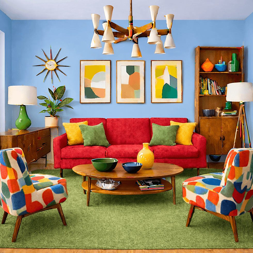
This is the living room from Part 2 of this series, where we created a tetradic color scheme using the color wheel.

This bedroom uses the same palette as the living room but shifts where and how the palette is used to create a restful setting with peaceful green walls, a large serene landscape, and blue jute area rug.
The bright color in the lamps and yellow vase keeps the bedroom from being a complete snore (pun intended), and visually connects the bedroom to the living room.
Why Cohesion Matters
Repeating colors in similar proportions throughout your home creates visual cohesion. Our brains like patterns and predictability. When every room feels completely unrelated, your home can feel visually chaotic.
I’ve visited homes where every room was painted a different color, with décor to match. One green room. One blue room. One yellow room. One red room. Etc. The effect is unsettling at best.
In another example, early in my career, a co-worker invited me to dinner at her parent’s home. Every first-floor room was wallpapered, and every wallpaper was different. I left as soon after dessert as I could without being rude because I was so distracted by all the visual clutter.
Once people recognize that smart use of color creates a cohesive and beautiful home, the practical questions start.
Frequently Asked Questions About Decorating With Color
Is it safe to choose a crazy tile and/or fixture color?
Items like wall or floor tile and kitchen/bath fixtures are not easily swapped out, so you are taking some risk by selecting, say, orange or bright green tile. That said, those are the colors I used for my fireplace hearth and kitchen backsplash tile.
The only way I can explain it is that I love those colors and visualized them in place when I saw my house for the first time
Today, I am more in love with them than I was when they were installed.
But, if I ever want to change up my home’s color palette, a session with my color wheel and a simple paint change will give my green and/or orange tile new life and sparkle.


What if I want to buy a mint green retro-style range?
I generally err on the side of the classics for large appliances and fixtures. Stainless steel, white, or black kitchen appliances, stainless steel or white sinks, and white toilets, bathtubs, and bathroom sinks are my jam because they truly go with everything.
But, in my experience, when someone buys, say, a vintage or retro range in a cool color, it’s not a spur-of-the-moment decision. Appliances in that category are thousands of dollars over a similar item in a more classic white, black, or stainless steel.
If you are willing to spend extra money on a mint green or butter yellow range, it’s because you LOVE it. If that’s the case, go for it, and include that color in your home color palette.
In another example of breaking the “buy only classics” rule, I know someone who bought a house primarily because the master bath fixtures and tile were the color of eggplants. She painted the bathroom walls and ceiling to match the fixtures and used eggplant as an accent color throughout her home. Now, that bathroom is truly her Happy Place.
If you love it, with a little ingenuity and your color wheel, you will make it work.
What if you live in one big open-plan space?
Think of your loft or open floor plan as one large room with several zones. Each zone serves a different purpose, like entertaining, dining, or sleeping.
Regarding furniture and décor, it’s especially important in an open-plan space to use the 60-30-10 rule to make the entire space cohesive. Group furniture and decor in “living zones” (dining, sleeping, entertaining, etc.) and ground each zone with area rugs to designate the space.
One way to use color in an open-plan space is to highlight architectural details like columns, built-ins, chair rails, alcoves, or ceiling detail (for example, coffering or beams).
First, paint your entire space a neutral color (like an off-white or a Super White), then:
Paint one architectural detail (like columns) in a slightly darker hue of that neutral color. Just make sure that the darker color has the same undertone as the wall color.
For a more subtle definition, paint that architectural detail the same color as the walls but with a different paint finish.
If your space has built-in cabinets or shelving, consider painting the back of the cabinet walls in a vibrant color, then use a coordinating palette for the furniture and decor in that living zone.
If your space includes larger architectural elements like a staircase and/or a fireplace that creates a “room within a room”, paint those walls in a color that’s in your 60-30-10 palette, or a pastel version.
Of course, you can always paint your loft or open floor plan space in a color other than white or off-white. I have found that pastels with a neutral gray undertone are much less likely to overwhelm an open plan space and add a bit of effortless sophistication.
For an open-plan space it’s critical to test the paint color by painting a small section of your selection on all four walls and living with it for a week or so to see how the paint reacts to different lighting conditions. Benjamin Moore’s peel-and-stick paint samples are generously-sized at 9” x 14.75”.
Can you deviate from your home’s color palette?
Absolutely! Every rule has exceptions. If you want one "surprise room" in your house, go for it. My preference is to select a small, self-contained room like a powder room, dressing room, or gym, and allow yourself to go crazy.
In my condo, which had a primarily green-and-blue color palette, I painted my bathroom a metallic violet and chose matching glass tile for the bathtub/shower enclosure.
A client whose home’s color palette is primarily soft grays and blues painted her 1st floor powder room black—walls, ceiling, and trim—just to add an element of surprise for her family, guests, and herself.
In another example, for years I have lusted after having a powder room wallpapered in Flavor Paper’s Kabloom in the Fruitpunch colorway. That choice doesn’t align with anything else in my home but I can’t get it out of my head. Some day.

What about my kids’/roommates’/partner’s/spouse’s rooms and color preferences?
I’ve most often found that if a color palette contains 5 to 8 colors, everyone in your household will find at least one color they like. Also, remember that you can create “new” colors by adding white, gray, or black to a hue in your palette to provide more choices.
However, I have talked to many moms with kids that want their bedroom walls painted (for example) Brat Green or the visual equivalent of Blackened Death Metal. If one of your kids absolutely insists on painting their personal space (most often a bedroom but sometimes a game room or loft) a color that’s (at best) inappropriate, you have a tough challenge on your hands.
Here’s how my mom handled this very situation with her kids.
She did not disparage her kid’s color choice or desire for self-expression, but there were conditions that had to be met in order to make the change:
The room to be painted had to be the kid’s bedroom.
If said kid shared the room with a sibling, the sibling also had to be all in on the new color.
The kid requesting the wall color had to paint the room themselves, with Mom providing guidance and expertise. Game-changer.
Décor changes (for example, bedding) were paid for by the kid requesting the color change.
If the requestor got sick of the color, they would have to repaint the room themselves.
This approach measured the kid’s commitment to the color change. But, if the requestor agreed to take on the responsibility for the painting project, Mom was OK with it.
Full disclosure. I was the primary color troublemaker.
In sixth grade, I got the smallest bedroom in our house all to myself, and I wanted yellow walls and orange accessories (analogous color scheme), which wasn’t in Mom’s wheelhouse.
But I agreed to her conditions, painted the room myself with her supervision, recovered a chair seat in orange cotton, and selected a yellow antique quilt from Mom’s collection of quilts made by her paternal grandmother. Mom even taught me how to use her sewing machine to make curtains.
I lived in that room very happily until I went to college.
Mom told me years later that at the time she told my dad that if the paint experiment was a disaster she could always keep the bedroom door closed. Happily, that never happened.
If decorating with color has always made you nervous, remember this: paint isn't permanent. Neither is most decorating.
Accessories can be moved. Pillows can be replaced. Furniture can be slipcovered or reupholstered. Even tile can become the star of the room when it's surrounded by the right supporting colors.
The color wheel isn't there to limit your choices. It's there to give you the confidence to make them.
Recommended Tools
Start with a color wheel to help you build your home color palette.
Paint fan decks let you “shop” for the perfect color without leaving home.
Peel-and Stick paint samples allow you to test colors in your actual rooms.
Invest in good paint brushes that you only have to buy once:
I own several Safavieh area rugs and love them for their color and pattern. The company offers a huge range of styles, materials, colors, patterns, and price points.
Monday Moose offers throw pillows and pillow covers in a wide variety of colors and styles.
I’ll admit it—Robert Abbey Lighting is spendy, but offers a fabulous variety of ceramic lamps to give your room the pop of color that it deserves.
Like Little Green Home?
Subscribe to get new posts that help you build a home you love—that loves you back.
Up Next
Hard-won advice for how to keep your reno on track.


Comments